Birnbaum, David J. “Toward a function library for statistical plotting with XSLT and SVG.” Presented at Balisage: The Markup Conference 2020, Washington, DC, July 27 - 31, 2020. In Proceedings of Balisage: The Markup Conference 2020. Balisage Series on Markup Technologies, vol. 25 (2020). https://doi.org/10.4242/BalisageVol25.Birnbaum01.
Balisage: The Markup Conference 2020 July 27 - 31, 2020
Balisage Paper: Toward a function library for statistical plotting with XSLT and SVG
David J. Birnbaum
Professor
Department of Slavic Languages and Literatures, University of Pittsburgh
(US)
David J. Birnbaum is Professor of Slavic Languages and Literatures at the
University of Pittsburgh. He has been involved in the study of electronic text
technology since the mid-1980s, has delivered presentations at a variety of
electronic text technology conferences, and has served on the board of the
Association for Computers and the Humanities, the editorial board of Markup languages: theory and practice, and the Text
Encoding Initiative Technical Council. Much of his electronic text work
intersects with his research in medieval Slavic manuscript studies, but he also
often writes about issues in the philosophy of markup.
Creative Commons Attribution 4.0 International License (CC BY 4.0)
Abstract
Computational textual humanities research often makes use of descriptive
statistics and graphic visualization to communicate quantitative information about
textual objects of study. SVG is capable of rendering any chart or graph a user
might wish to deploy, but there is no standardized function library for XSLT or
XQuery comparable to, for example, the support for statistical analysis and
visualization available in Python Pandas, Julia, and R. Neither is there any
standard XSLT or XPath visualization library comparable to the D3.js
(Data-Driven Design) JavaScript library that has come to dominate
high-quality informational graphics on the World Wide Web. This paper begins to
explore the possibility of developing such library resources without leaving the XML
ecosystem.
Computational textual humanities research often makes use of descriptive statistics
and graphic visualization to communicate quantitative information about textual objects
of study. SVG is capable of rendering any chart or graph a user might wish to deploy,
but there is no standardized function library for XSLT or XQuery comparable to, for
example, the support for statistical analysis and visualization available in Python
Pandas, Julia, and R. Neither
is there any standard XSLT or XPath visualization library comparable to the D3.js (Data-Driven Design) JavaScript library that has come
to dominate high-quality informational graphics on the World Wide Web.[1] The XML family of languages (and specifically XPath
[including XPath functions], XSLT, XQuery) has not prioritized mathematical computing, but it is
nonetheless tempting to ask whether it would be possible to save XML developers the
inconvenience of stepping outside the XML stack to, for example, plot a regression
line
or draw a Bézier spline.[2]
Statistical programming languages such as Python Pandas and R may employ vectorization
to achieve performance benefits in computationally intensive operations. XSLT supports
syntax that is compatable with a functional perspective (e.g., functional mapping
rather
than sequential iteration), but insofar as XSLT is a declarative language, it does
not
naturally expose how it works internally.[3] Because the user has limited control over how XSLT engines perform the
operations requested in an XSLT stylesheet, it is possible, and perhaps likely, that
some statistical operations will prove too computationally intensive to be implemented
practically in XSLT, especially with large amounts of data. With that said, not all
textual humanities data is big, and not all statistical computation and graphing is
prohibitively complex computationally. This report begins to explore the possibility
of
developing support libraries for statistical computation and graphing without leaving
the XML ecosystem.[4]
All code described in this report, with documentation, is available at
https://github.com/djbpitt/plot under a GPL 3.0 license.
Preliminaries
Descriptive and inferential statistics
Descriptive statistics deals with the computation
of features (called parameters) of sets of data
(called populations).[5] Descriptive statistics can be contrasted to inferential statistics, which makes predictions (called statistics) about a population on the basis of a subset
of the population data (called a sample). It is not
our place to generalize about the relative need for decriptive and inferential
statistics in the community of computational textual humanists, but because our own
needs have been entirely descriptive, in situations where descriptive and
inferential methods differ (e.g., the computation of a standard deviation), we have
implemented the descriptive versions of the formulae.
What to plot
One of the main purposes of plotting lines or curves that pass through or by
points in two-dimensional space is to highlight trends in the values.[6] This type of plotting makes sense for some, but not all, types of
two-dimensional data. The library functions introduced here make the following
simplifying assumptions, with the understanding that these are not intended to
accommodate all possible data relationships and visualizations:[7]
Independent and dependent variables.
There is an independent variable along the X axis and a dependent variable
along the Y axis.[8]
The independent values, along the X axis, are
numerical: either discrete, like integers, or continuous, like
doubles. These numerical values are ordered monotonically on
the X axis.[9]
The dependent values are also numerical,
and their values are also arranged on the Y axis in their natural numerical
order.
Trends are not intermediate values.
Because lines, polylines, and splines are continuous, they may seem to
create a visual impression of describing intermediate values. For example,
if the values on the X axis are years (discrete numerical values) and the Y
value changes between consecutive years, a sloping connecting line or curve
between adjacent points does not describe any real data between one year and
the next. And where the values on the X axis are continuous, so that there could in principle be
intermediate values between two real ones, in descriptive statistics we do
not infer values for data that is not part of the population. While it may
be informally common-sensical that a trend suggests likely missing
intermediate values, connecting lines or curves in a descriptive context
should nonetheless be regarded as representing the shape of a trend observed
in the population, and not a prediction about lacunae in the data.
Architecture
The code discussed here observes the following design strategies:
Deploy as a package. The
<xsl:package> feature of XSLT 3.0 improves on the support
for modular development available through <xsl:import> or
<xsl:include>. In particular,
<xsl:package> allows the developer to distinguish public
from private components, about which see below. The XSLT 3.0 specification
leaves the method of resolving package locations to the discretion of the
implementation, and we use a Saxon configuration file to manage the mapping of
package name to filesystem object.
Validate input first. Our implementation of
the functions illustrated here specifies datatypes for all XSLT elements that
support the @as attribute, but except in the case of schema-aware
validation, XSLT 3.0 does not support validation of complex, user-defined types.
The code discussed here does not use schema-aware validation because it is
intended to run under Saxon HE. For that reason, we use conditional expressions
(e.g., <xsl:if>) to check the shape of the input parameters
more strictly than would be possible solely through (non-schema-aware) datatype
validation, and we terminate execution with an informative error message when a
function encounters bad data.[10]
Functions are simple and self-contained.
Functions do only one thing and use only data provided through parameters.[11] The library functions have no dependencies on global (stylesheet) variables.[12]
Expose public functions and variables. The
only functions exposed by the library are those that are intended to be called
directly by end-users. The only variables exposed are those that the user might
want to overwrite.
Hide private helper functions. All functions
and variables that are not public are left as private. Users are unlikely to
call functions directly that are not intended to be called directly, so the main
point of hiding them is not to prevent their use, but to reduce clutter by
preventing their being shown in a content-completion prompt.
Reuse code to support default values and multiple
arities. XSLT function parameters cannot be optional, which means
that XSLT does not provide a convenient way to declare a default value for
parameters not supplied when a function is called. We work around this
limitation by writing the function with the highest arity first, and then
declaring lower-arity versions with the same name that supply the missing
default values and pass the call along to the highest-arity version. For
example, the djb:spline#3 function expects supplied values for
$points (the points to plot), $scaling (the
curviness of the spline), and $debug (whether to output diagnostic
information or just render the curve). spline#2 accepts only the
first two of those arguments, and defaults $debug to
False. spline#1 accepts only $points,
and defaults $scaling to 0.4 and $debug
to False.
First functions
Overview
The initial motivation for beginning with the three types of tasks introduced here
came from our need to output curved splines, instead of segmented polylines, to
connect points in a line graph. We then developed additional functions to support
analytic representations of information in those graphs. Specifically:
A Bézier spline will connect all points
supplied in the input with Bézier curves, rather than straight line
segments.
Although a spline uses soft curves through the data points instead of
abrupt angles, if there are extreme fluctuations in the data, it may
nonetheless be difficult to discern whether the data observes any trend.
Smoothing provides a method of reducing
extreme values, which can make it easier to discern a trend that spreads
across the data. Data points can be piped first through smoothing (to
flatten extreme fluctuations) and then into spline drawing, resulting in a
smoother, flatter spline. We implement several types of smoothing (see
below).
Linear regression computes a function
that approximates a trend in changes in value across a sequence of data
points. We implement linear regression using the predominant least squares method, which plots a line or other
shape that minimizes the total squared distances of the data points from the
values output by the regression function. [Brown 2019] The
simplest, and perhaps most common, type of linear regression yields a
function that describes a straight line through the data points (drawn with
an SVG <line> element), but linear regression can also
describe parabolas and more complex shapes.[13] Our implementation provides functions that plot straight lines
and parabolic arcs.
Of these three sets of functions, only the Bézier spline plots the actual data
points supplied as input. Smoothing and linear regression, on the other hand,
transform the original points. We think, then, of the spline function as a visualization tool, while the other functions discussed
here are analytical tools that create new data
points, which can then be plotted using lines, parabolas, or splines.
Bézier splines
The Bézier spline is a drawing instruction, accepting as input the points that
would be used to plot a polyline (sequence of connected line segments, that is, a
traditional saw-toothed line graph) and returning a smoothed curve that passes
through those points. We provide the following functions:
djb:spline($points as xs:string+, $scaling as xs:double, $debug as
                                          xs:boolean)
The value of $points is a sequence of at least three
pairs of X,Y coordinates. The X and Y values must be castable as doubles
and separated by a comma, and there must be no whitespace.[14] The value of $scaling is a double that ranges
from 0 (which outputs a polyline with angled transitions at
the knots, that is, the place where segments meet) to 1.
Higher values produce curvier splines, and values between
.2 and .5 yield the most aesthetically
satisfying results. When $debug is set, the output includes
visual representations of points and lines used to compute the
coordinates for the Bézier curve segments; this is illustrated below in
Figure 1.
djb:spline($points as xs:string+, $scaling as
                                          xs:double)
The arity-2 version of the function calls the arity-3 version with a
default $debug value of False.
djb:spline($points as xs:string+)
The arity-1 version of the function calls the arity-3 version with a
default $debug value of False and a default
$scaling value of 0.4.
The @d attribute of the SVG <path> element (see
SVG Path) can describe quadratic and cubic Bézier curves, but
in order to do so the user must supply X and Y coordinates for the endpoints of the curve segments and the control points (also called anchors or handles) that determine
the shape of the segment. The endpoints are given in the input, which means that the
challenge in drawing a spline instead of a polyline lies in computing the
coordinates of the control points. We implement an adaptation of the methods
described by Berkers 2015 for PHP and Embry 2015 for
JavaScript; below is sample output:
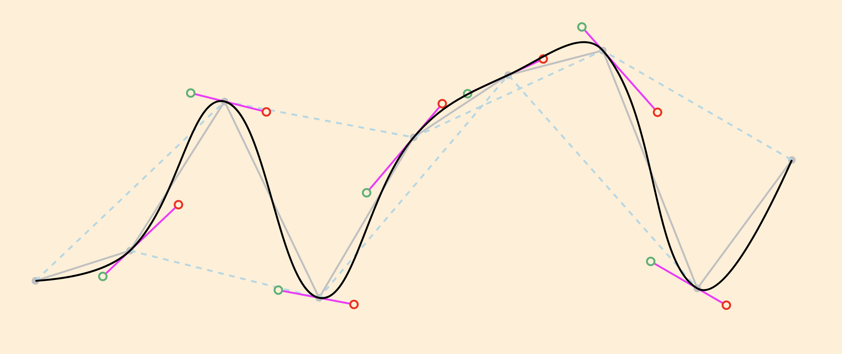
Figure 1: Spline example
The value of $points is a sequence of data points
represented, in this example, by the strings '50,182' '100,166'
'150,87' '200,191' '250,106' '300,73' '350,60' '400,186'
'450,118'. We set $scaling to 0.4
and $debug to True, which causes the function
to output not only the spline, but also the original points and line
segments connecting them (gray), joining lines that determine the slope
of the control lines (dotted pale blue), control lines (fuchsia), and
incoming and outgoing control points (green and red,
respectively).
We use our djb:spline() function below in pipelines, where our
smoothing functions compute adjusted Y values, which can then be plotted in various
ways, e.g., as a spline, as points, or as a polyline. We can think, then, of a
distribution of responsibility where the smoothing functions determine modified
point coordinates in a way that is agnostic about presentation, and those adjusted
coordinates can then be passed into the spline function or an SVG
<polyline> in a way that is agnostic about the source and
meaning of the data.
Least squares linear regression
A least-squares regression equation defines a line or curve that minimizes the
squared Y distances of that line or curve from all points, that is, that comes as
close as possible to describing the relationship between the independent and
dependent variables. The simplest regression equation plots a straight line; more
complex equations can include any number of curves or bends. We implement functions
to plot straight lines and parabolic curves.
Regression lines
Least squares regression functions to plot straight regression lines can be
derived using standard XPath mathematical functions and operators: addition,
subtraction, multiplication, division, exponentiation, and the
sum() function. We provide the following functions:
djb:regression-line($points as xs:string+, $debug as
                                             xs:boolean?)
This plots a straight regression line, where $points
has the same lexical shape as the $points argument to
the djb:spline() function (see above). If
$debug is True, the function also
returns, in an XPath map, the values of the slope and intercept used
to plot the line.
djb:regression-line($points as xs:string)
The arity-1 version of the function calls the arity-2 version with
a $debug value of False.
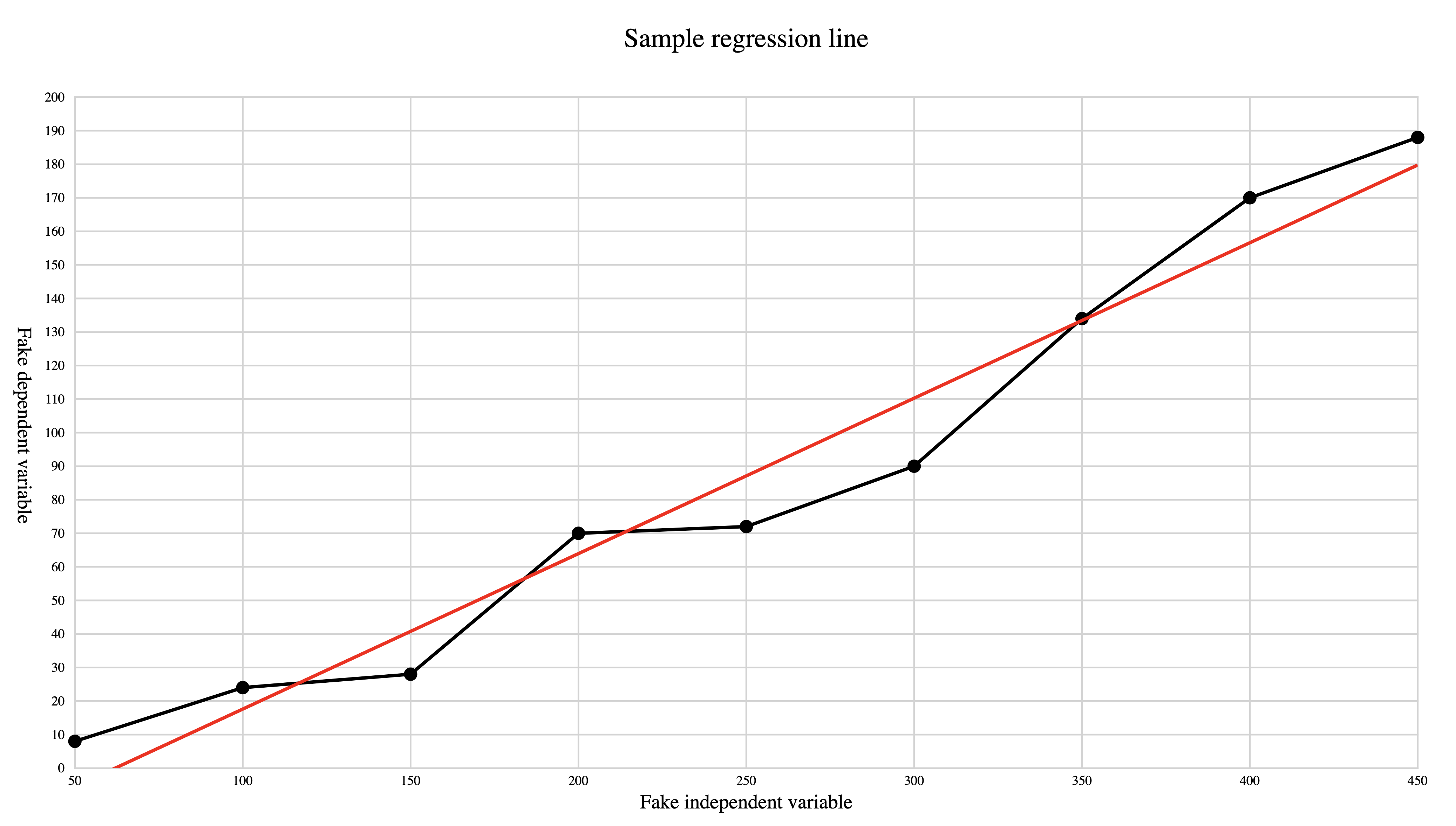
The following illustration shows a regression line:
Figure 2: Sample regression line
The regression line is plotted to minimize the squared vertical
distances of all data points from the line, that is, to pass as
closely to all points as is possible. The line is drawn from the
smallest X value to the largest; we use an SVG clip path to avoid
overflowing the designated coordinate space (in this example the
lower left corner of the regression line would reach below the X axis).[15]
Regression parabolas
Much as least squares can be used to fit a straight regression line, it can
also fit more complex shapes. A straight line is described by y = ax + b , where a
is the slope of the line and b is the Y
intercept, that is, the Y value when X = 0. A parabola is described by y = ax2 + bx + c . We
provide the following function:
djb:plot-parabolic-segment($points as xs:string+, $x1 as
                                             xs:double, $x2 as xs:double)
Uses the full set of points to compute the parabolic function and
then plots a parabolic segment between the two X values.
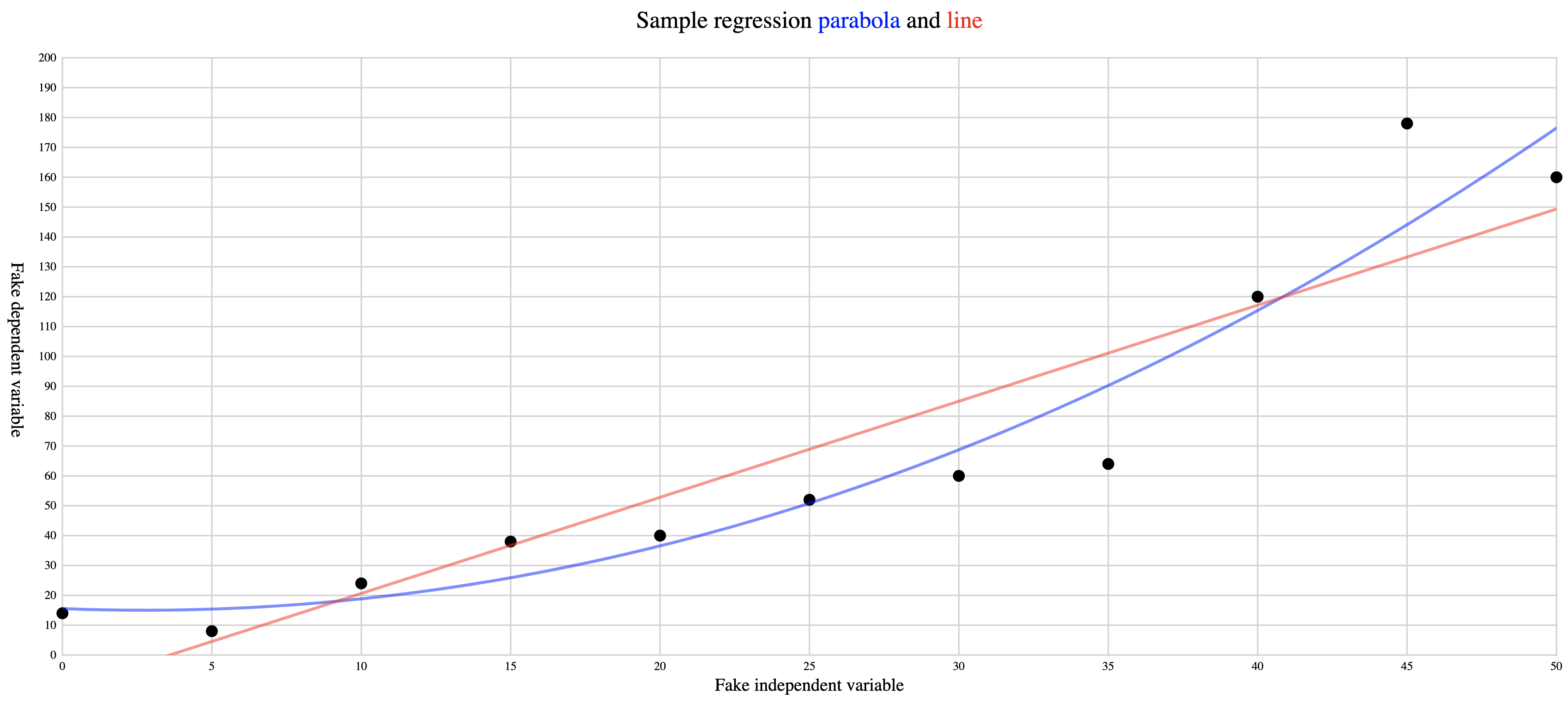
The following illustration shows a regression line and regression parabola for
the same points:
Figure 3: Sample regression line and regression parabola
The regression line and regression parabola are both plotted to
minimize the squared vertical distances of all data points from the
line, that is, to pass as closely to all points as is possible. Both
are drawn from the smallest X value to the largest; we use an SVG
clip path to avoid overflowing the designated coordinate space (in
this example the lower left corner of the regression line [although
not the parabola] would reach below the X axis).
Smoothing
Jittery data points, that is, data where the Y values of adjacent points may vary
by large amounts, can obscure trends in the data. Replacing the original Y value of
a point with an average of its value combined with those of a specified number of
its nearest neighbors (this range is called the window or bandwidth) can reduce the
effect of extreme fluctuations and make a trend more perceptible. The simplest
version of this sort of rolling average is
unweighted, that is, it computes the arithmetic mean of the points contained in the
window, where each point within the window contributes equally to the averaged
value.
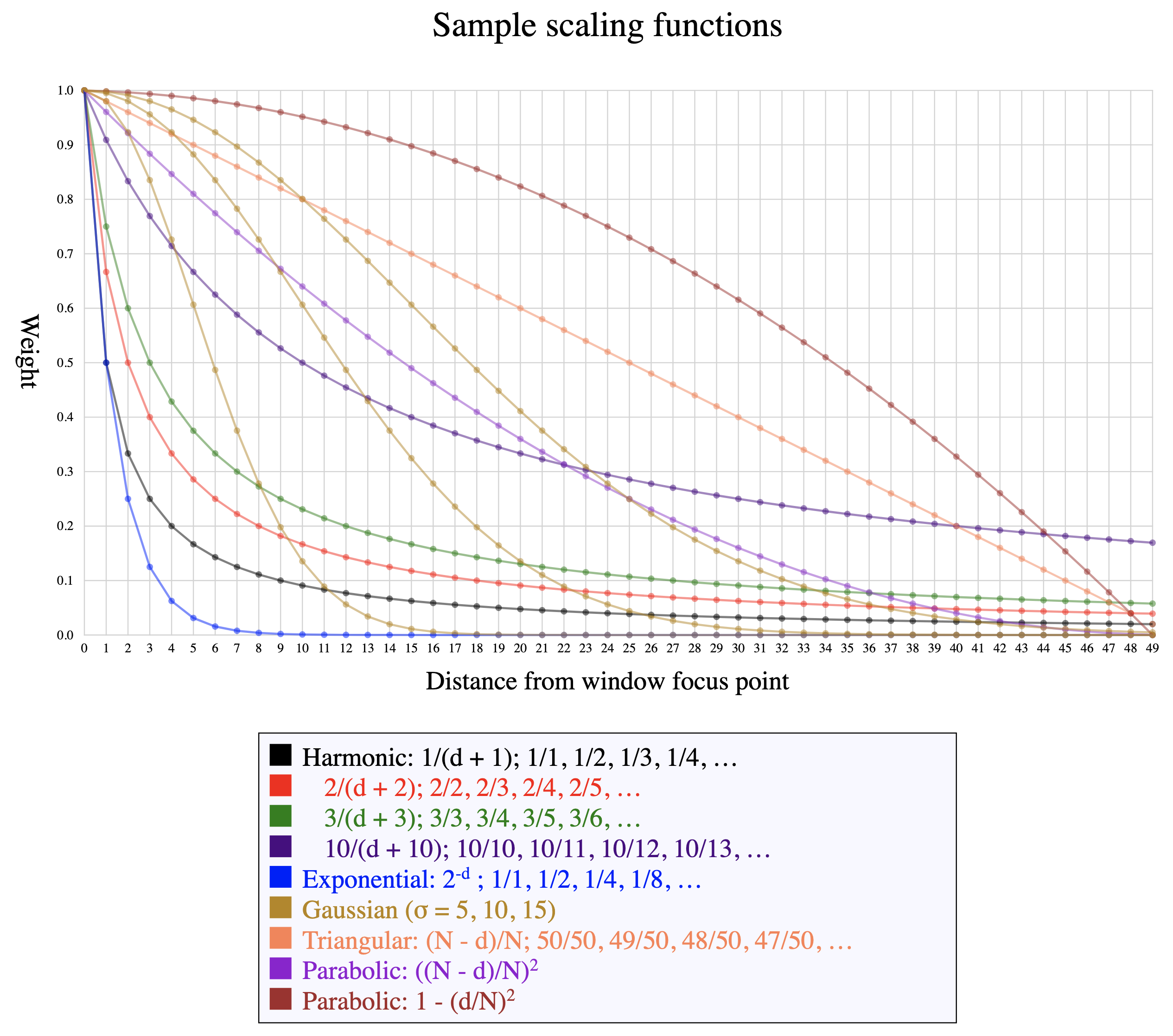
In situations where it is desirable for points closer to the focus (the presumptive center of the window) to be weighted more
heavily than those toward the periphery, though, a non-constant smoothing function
(called a kernel) can be applied to the points
before their weights are averaged.[16] A weighted kernel function normally weights the points in the window in
inverse proportion to their distance from the focus, so that the focal point
receives full weight, its nearest neighbors in either direction less weight,
neighbors just beyond those still less weight, etc. The choice of a kernel function
determines how much each point in the window influences the new computed value, and
the image below illustrates how some of the available functions adjust the assigned
weights as they move from the focus (weight of 1, at the far left) further away
(further to the right).
Figure 4: Smoothing functions
These functions all assign full weight to the focal point and
progressively less weight to points that are further from the focus in
either direction.
We work with a symmetrical window that assigns equivalent value to point before
and points after the focus. This decision means, though, that we run out of
neighboring points on one side or the other as the focus nears the extreme X values
on either end. Any solution needs to cope, in one way or another, with the asymmetry
inherent in the fact that the first point has no preceding neighbors and the last
point has no following ones.
Some implementations negotiate this edge phenomenon by using a trailing window,
instead of a symmetrical one. With a trailing window size of 5, for example, the
points that contribute to computing a smoothed value for point 5 are points 1–5,
those for point 6 are 2–6, etc. A trailing window begins to report values only once
there are enough points before the focus to make up the window.[17] Other implementations cope with asymmetrical input at the edges by not
computing a smoothed value there at all.[18] Our approach instead plots edge values by recruiting additional points
from the other side, as needed. For example, with a window size of 5, the
computations for points 1 through 3 all use a window that ranges from point 1
through point 5, but with different focal points, and therefore with different
weights for the five window points.[19]
Some kernel functions (harmonic, exponential, Gaussian) approach 0 asymptotically
and can therefore be applied to a window of any size, although extending the window
size beyond the point where the function approaches 0 has negligible influence on
the result. Other functions (triangular, parabolic) may cross into negative values
or increase again after reaching 0, and therefore need to include the window size
in
their computation.
The following example shows how the output of the smoothing operation is shaped by
the choice of kernel function.
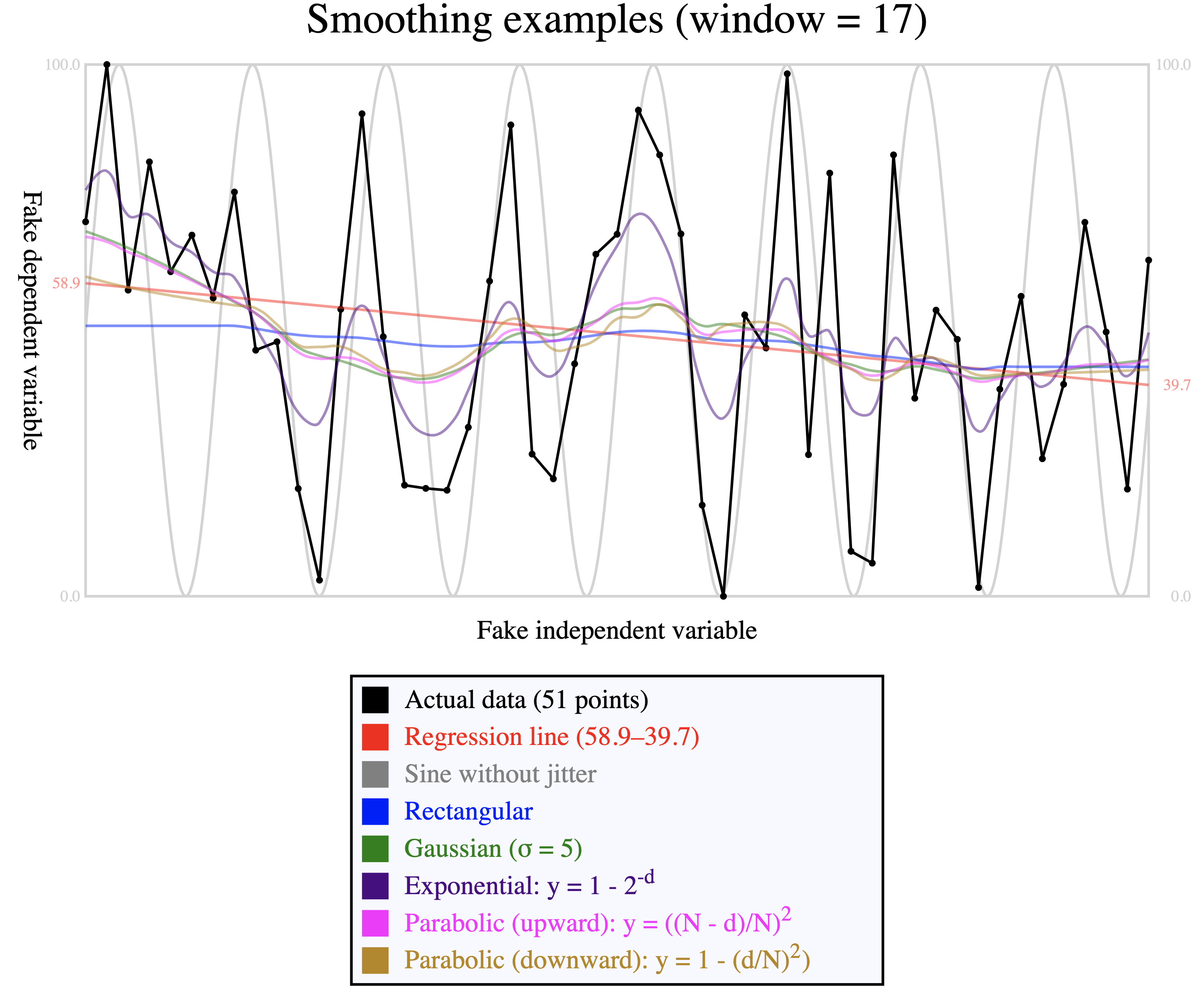
Comparison of smoothing function: Comparison of smoothing functions
This image was created by generating a sine wave (light gray). The
values created by that function are then distorted by adding random
jitter and recentering between 0 and 100 (the actual data, in black). We
set a window equal to one third of the data; larger windows produce
smoother curves, while smaller windows leave more jitter. The curves
differ according to the kernel applied because the way in which the new
value is influenced by its neighbors depends on how quickly the
weighting curve decreases. For reasons described above, the rectangular
kernel plots a straight horizontal line for the first and last eight
data points.
The most useful kernel and window size depends on the shape of the data, and is
therefore left under the control of the user, and the process is to create a
sequence of weights according to the desired kernel and then rewrite the Y values
by
smoothing them according to those weights. We provide the following
functions:
djb:get-weighted-points($points as xs:string+, $kernel as xs:string,
                                          $window-size as xs:integer, $stddev as xs:integer) as
                                          xs:string+
The points are original points as strings in X,Y format.
Supported kernel values are gaussian,
rectangular, exponential,
parabolic-up, and parabolic-down. The
window size must be a positive odd integer greater than or equal to 3.
The standard deviation is relevant only for the Gaussian kernel, and is
otherwise ignored. The function returns a sequence of points, in the
same format as the original, with new Y values computed according to the
kernel and window size.
djb:get-weighted-points($points as xs:string+, $kernel as xs:string,
                                          $window-size as xs:integer) as xs:double+
As above, but without specifying the standard deviation, for which a
default value of 5 is supplied. As noted above, the standard deviation
is relevant only for the Gaussian distribution.
Smoothing should be used carefully, and acknowledged explicitly, because it
involves rewriting, and not merely organizing, the data. Smoothing relies on the
assumptions that extreme local fluctuation is noise, rather than signal, and that
noise is random, so that removing it wherever it occurs does not distort (and, on
the contrary, reveals) any overall trend. Where this assumption is incorrect,
smoothing risks removing variation that we might care about—that is, removing
signal, and not only noise.
Retrospective
Development of the functions described here has served two purposes. On the one hand,
we had encountered situations in actual projects where we would have used some of
them
(especially spline plotting) had it been readily available, and we anticipate using
some
of these functions in actual projects in the future. Beyond that, though, the
experimental aspect of this exploration encourages us, now looking forward, to resist
the temptation to use XSLT only to extract and export data that we then visualize
in
traditional statistical programming contexts (e.g., Python Pandas, Julia, R, Microsoft
Excel, D3.js). Instead, once we are already using XSLT to process XML input because
XSLT
is a superior language for that purpose, and once we are already using SVG (an XML
vocabulary) for data visualization because of the advantages it offers over raster
graphics for that purpose, we are newly encouraged to think about harmonizing our
workflow by looking more closely and deeply into XSLT also for solutions to statistical
computation and plotting tasks.[20]
Implementing statistical computation and plotting in XSLT has been challenging because
it requires not only specific XSLT programming skills (that is, different skills from
those that typically predominate in digital text processing), but also an understanding
of statistics and advanced mathematics that has not traditionally been part of the
training of humanities scholars. To be sure, using pre-existing statistical plotting
functions responsibly also requires an understanding of statistical assumptions and
methods that has not traditionally been part of that training, but learning to use
functions that someone else has developed is nonetheless less challenging than
implementing them from scratch. Whether the first steps, illustrated here, toward
an
open-source XSLT function library will encourage community participation and uptake
remains to be seen, but these modest early successes encourage us to be optimistic
about
the potential.
Future prospects
Expanded functionality
The functions described above are a small portion of the types of computation and
presentation that are available in other analytic environments, such as Pandas, Julia, R, and D3.js. Charts and graphs supported by D3 includes bar, boxplot, chord,
dendrogram, density, doughnut, heatmap, histogram, line, lollipop, network,
parallel, pie, radar, ridgeline, sankey, scatter, stream, treemap, violin, and
others, and many of those depend on fundamental statistical computation (e.g., the
Tukey five-number summary for boxplots, kernel density curves for violin plots, and
others). Beyond the computation and plotting, in R, for example,
functions that provide these visualizations accept parameters to specify axis and
chart labels, legends, data labels, and other types of documentation that are needed
for effective data visualization. Providing this functionality within an XSLT
context could be valuable to developers who currently offload responsibility for
statistical computation and visualization onto non-XML tools and frameworks that
rely on languages in which they have less expertise than XSLT.
XQuery
We performed our initial implementation in XSLT, but if there is a need for or
interest in similar functionality in XQuery, translating the XSLT implementations
to
XQuery is straightforward.
Interactive animation
Graphic visualization can benefit from interactivity that may range from
relatively straightforward highlighting on demand to more complex on-the-fly
computation of values and re-plotting of graph and chart objects in response to
dynamic user input.[21] More ambitiously, the extremely capable JavaScript D3.js library, which
also generates SVG, is richly interactive, and nothing precludes augmenting the
functions introduced here to support comparable interactivity.
Especially in the context of the desire to remain within the XML ecosystem that
motivated this experiment with statistical plotting initially, the recent release
of
Saxon-JS 2.0 invites us to explore how XSLT, and not only JavaScript, can be used
to
control interactive behaviors. As Saxon JS writes:
Because people want to write rich interactive client-side applications,
Saxon-JS does far more than simply converting XML to HTML, in the way that the
original client-side XSLT 1.0 engines did. Instead, the stylesheet can contain
rules that respond to user input, such as clicking on buttons, filling in form
fields, or hovering the mouse. These events trigger template rules in the
stylesheet which can be used to read additional data and modify the content of
the HTML page.
We look forward to exploring this type of XSLT-based interactive functionality in
situations where we might previously have relied exclusively on JavaScript.
Appendix A. Statistical glossary and formulae
Anchor points
See control points.
Bézier curve
A curve described by two endpoints and
one (quadratic) or two (cubic) control
points that do not lie on the curve. Supported as part of the
@d attribute of the SVG <path>
element.
Control points
Also called anchor points or handles. The shape of a Bézier curve is described by its endpoints and its control points.
Cubic
A cubic Bézier curve has two control points and is capable of bending in up to
two places (S shape). We use cubic Bézier curves to draw all of the curve
segments of our spline except the first and last, which we draw as quadratic Bézier curves.
Descriptive statistics
Quantitative analysis of a population,
which yields parameters. Cf. inferential statistics.
Endpoints
The points that mark the beginning and end of a line segment or Bézier curve. The shape of a Bézier curve is
defined by a combination of its endpoints and its control points.
Focus
We use the term focus in the context of
kernel smoothing to refer to the point
at the presumptive center of the window. We
qualify the center as presumptive because we keep the window
size constant, and if there are not enough points on both sides of the focal
point to fully populate the window symmetrically, additional points are
recruited from the longer side to compensate for running out of points on
the shorter side.
Handles
See control points.
Inferential statistics
Quantitative analysis of a sample, which
yields statistics. Cf. descriptive statistics.
Kernel
A function used to control weighted smoothing. Different kernels assign different weights to
points according to their distance from the focus.
Least squares
A way of computating a regression
function that minimizes the sum of the squared Y distances of
all points from the regression line or curve. This is the predominant method
used in linear regression.
Linear regression
A model that uses an equation to approximate the relationship between
independent and dependent variables. The equations may describe lines or
more complex shapes. Linear regression often uses least squares to compute a function that describes a
straight line or curve that comes as close as possible to the actual data
values.
Mean
Sum of values divided by count of values. Supported natively by the XPath
avg() function.
Parameter
Descriptive analytic measurement of a population. Cf. statistic.
Polyline
Connected line segments, supported by the SVG
<polyline> element.
Population
All items of interest, appropriate for descriptive
statistics. Cf. sample and
inferential statistics.
Quadratic
A quadratic Bézier curve has one
control point and is capable of bending
in one place. We use quadratic Bézier curves to draw the first and last
curve segments of our spline; we draw the intermediary segments as cubic Bézier curves.
Regression function
A function that describes a line or curve that approximates the
relationship of independent and dependent variables.
Sample
Part of the population, from which
inferences are drawn, using inferential
statistics, about the population. Cf. population
and descriptive statistics.
Smoothing
A method of simplifying a relationship between independent and dependent
variables by reducing random noise to make it easier to perceive trends in a
signal.
Spline
Continuous smooth curve connecting a sequence of points. Can be described
with the @d attribute of the SVG <path>
element.
Standard deviation
σ = √{ ∑(xi-µ)2/n} where µ is the population mean and n is the population size. This is the square root
of the average squared deviation from the mean, that is, the square root of
the variance.
Statistic
Inferential analytic measure of a sample.
Cf. parameter.
Variance
Average squared deviation from the mean.
σ2 = { ∑(xi-µ)2/n} where µ is the populationmean and n is the populationsize. The variance is the value of the
standard deviation squared.
[2] XPath 3.1 provides support for basic arithmetic in the default function
namespace (http://www.w3.org/2005/xpath-functions, conventionally bound to
the prefix fn:), as well as some more mathematically advanced or
complex functionality (trigonometric functions, exponentiation and logarithms)
in a separate mathematical namespace (http://www.w3.org/2005/xpath-functions/math, conventionally
bound to the prefix math:). Most mathematical functions that were
supported earlier only as EXSLT-math extensions (in the http://exslt.org/math namespace, originally bound conventionally
to the prefix math:, and now to exslt-math: because
math: is in common use for http://www.w3.org/2005/xpath-functions/math) have been added to
one or the other of these namespaces, or, within Saxon, as extensions in the
http://saxon.sf.net/ namespace
(conventionally bound to the prefix saxon:). There is no function
support for calculus or linear algebra in the standard libraries, in EXSLT-math,
or in the popular FunctX extension library. See XPath functions, EXSLT-math, Saxon extension functions, and FunctX.
[3] One exception is the @saxon:threads extension attribute available
on <xsl:for-each> in Saxon EE, about which see Saxon threads.
[4] The author is grateful to Emmanuel Château-Dutier for productive
conversations, comments, and suggestions.
[5] Statistical terms used in this report are listed and defined in Appendix A.
[6] In inferential statistics these trends would support predictions about
values not represented directly in the sample. In a descriptive context, a
trend is a summary perspective on some properties of the distribution of
actual observations.
[7] We concentrate in this report on two-dimensional scatter plots, which
occupy a small part of the graphic visualization universe. A more complete
XSLT and SVG graphics library would include other types of plots (e.g., bar
charts, pie charts, to cite only the most familiar examples), for which
these assumptions would not apply for reasons that include dimensionality,
data categories, and presentational geometry.
[8] Other terms may be used for these concepts (e.g., explanatory and response variable, respectively), but regardless of
the terminology, the assumption is that one variable changes under
the influence of the other (for example, death may be caused, at a
certain rate, by specific diseases, but disease is not caused by
death). Not all relationships involve a single independent and a
single dependent variable, and not all apparent correlations are
meaningful (for an amusing perspective on which see Vigen, Spurious). Our examples arrange the independent
variable along the X axis and the dependent variable along the Y
axis, as is common, but nothing prevents us from inverting that
presentation, so that the X value changes in response to the Y
one.
[9]Categorical data, which does not
have a natural order comparable to that of numerical data, does not
describe a trend. Ordinal data has
a natural order without being explicitly numeric. For example,
ordinal ratings like excellent, good, fair, and poor can be arranged
from best to worst or vice versa, but there is no natural way to
quantify the distance between adjacent values. That is, the distance
between ordinal values like “good” and “excellent” cannot be
expressed with the same sort of accuracy as the arithemetic distance
between the numerical values “3” and “4”.
[10] At the moment we raise errors with the XPath error()
function, rather than with <xsl:message
terminate="yes">, because Saxon through version 10.1
handles error reporting from error() and
<xsl:message> differently, and our XSpec unit
tests can trap error() more easily. This makes it possible
to test constraints beyond standard datatyping (e.g., a requirement that
a parameter value be not just an integer, but a positive odd integer
greater than 3) by supplying illegal values in an XSpec test that
expects a dynamic error to be raised.
[11] In the current version of the Bézier spline code, two public variables
are declared at the package level. Functions that accept a
$debug parameter may write diagnostic information to
stderr (using <xsl:message>), and
may return a complex result. For example, the function that plots a
regression line returns an SVG <line> element; when
the value of $debug is true, it also returns the slope and
intercept values in an XPath map.
[12] We use the http://www.obdurodon.org namespace, bound to
the prefix djb:, for library functions and the
http://www.obdurodon.org/function-variables namespace,
bound to the prefix f:, for function parameters and
variables. This ensures that no fully qualified function parameter or
variable name will clash with the fully qualified name of any stylesheet
parameter or variable.
[13]We can also use linear regression to fit polynomials to
data. The use of the word linear in both cases may seem
confusing. This is because the word ‘linear’ in linear
regression does not refer to fitting a line. Rather it refers to
the linear algebraic equations for the unknown parameters
βi,
i.e. each βi has exponent 1. … A
parabola has the formula y =
β0 + β1xx
+
β2x2.
[Orloff and Bloom 2014 4–5]
[14] We impose stricter lexical constraints, specifically with
respect to whitespace, on the input than SVG requires for the
@d attribute on <path>
elements because the looser constraints in SVG add no meaningful
functionality and are more difficult to debug.
[15] Clip paths are declared with <clipPath>
and invoked (confusingly, because the spelling differs) with
@clip-path.
[16] A constant smoothing function, where all points in the window are weighted
identically, is called a rectangular
kernel. For examples of kernels in common use see Kernel functions.
[17] The use of a trailing, rather than symmetrical, window embeds a tacit
assumption that preceding points are meaningful in a way that following
points are not. This assumption may be correct in some time-series
situations, where a trend incorporates a knowledge of and possible response
to previous values, while future values are unknown. It is not, on the other
hand, especially likely to be correct with other types of ordered series,
such as the number of characters on stage in a scene of a play or the number
of lines in a poetic stanza.
[18] Not reporting values at the edges has the advantage of computing all
points on the basis of exactly the same type of neighboring data. It has the
disadvantage of reporting nothing at the edges, although there is some
meaningful neighboring information there, even though it is not the same as
in other locations in the sequence of values.
[19] This introduces distortion at the edges of the smoothed values, which is
most noticeable as a straight horizontal line at either end of the curve
described by a rectangular kernel, since the absence of differential
weighting in a rectangular kernel means that all focal points within the
same window are averaged to the same value, regardless of whether they are
centered in the window or skewed toward one or the other side.
[20] The suitability of XSLT for these purposes is improved by 3.0 features, of
which we currently use packages, higher-order functions, iteration, maps, and
arrays.
The advantages of SVG in camparison to raster images for data visualization
includes scalability without pixelation, compactness (especially in the case of
charts and graphs that consist primarily of regular geometric shapes), and ease
of integration with JavaScript for dynamic interactivity in a Web
context.
[21] As an example of the use of animation, the Comparison of smoothing function illustration in this report may be
difficult to read because of the number of lines it includes, and it was not
actually designed for static viewing. The version rendered here is a static
PNG because the Balisage proceedings do not support dynamic SVG images, but
the PNG is a screenshot of an SVG file with JavaScript animation, available
in the project GitHub repo, that highlights the corresponding curve when the
user mouses over a colored rectangle in the legend, making it easy to see
each curve clearly on demand.